
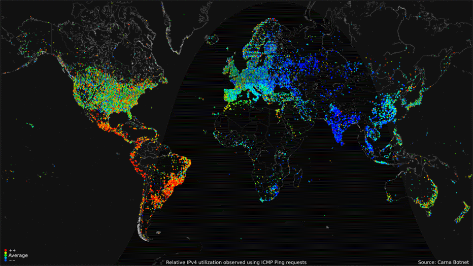
In 2013, an anonymous hacker mapped the Internet through illegal means, and in the process exposed rampant security problems. The project, called Internet Census 2012, used 420,000 networked devices, dubbed the Carna Botnet, to ping IP addresses across the globe in 2012. Every one of the devices was either entirely unsecured with no password protection, or used the standard password "root" that comes with many off-the-shelf routers (users are supposed to change the password, but rarely do). The hacker released all of the collected data to the public domain in a sort of research paper. The animation above is a map based on that data that shows 24-hours of Internet use. CARNA BOTNET
06.10.15
WHEN YOU HEAR the word “Internet,” what do you picture in your mind? Is it a series of pipes, or a three-dimensional spacescape, or maybe a browser on your phone’s screen? Visualizing the Internet is tough, perhaps because it’s this weird combination of physical and conceptual things. But that’s also what makes it an appealing endeavor.
There is of course a physical architecture of cables, wires and switches that exists, but these material things are more like a backbone or a substrate that enables the Internet to exist. And while these tangible aspects of the Internet are hard enough to visualize, the conceptual part is a mind bender. People have assigned all sorts of physical descriptors to it, attempts to give it a shape. They call it the inter-tubes or the inter-webs, the information superhighway, or the cloud.
Perhaps the most ubiquitous nickname is also the least concrete: cyberspace. But even this amorphous moniker implies a geography, or at least a spatial aspect. And where there is a spatial aspect of any sort, even imagined, there will be maps.
But how do you map the Internet? This is an intriguing problem that has drawn many different attempts from cartographers, computer scientists, visual artists, data wranglers and information scientists. We’ve collected some of our favorite maps of the Internet in the gallery above, from the adorably schematic 1977 map of the Internet’s larval stage, known as ARPANET, to geographical maps of the deep-sea cables that transfer the information, to sophisticated computer-generated topologic maps of the connections that make up cyberspace.
Some of these visualizations focus on websites, some on users, some on connections and some on concepts. Many use proximity to represent some sort of relatedness, just as Waldo Tobler taught cartographers. For some, closeness represents similarity, for others it indicates connectedness. Others have mapped the Internet onto an existing architecture, like the Tokyo Metro.
The results are varied and beautiful and will give you lots of visuals to fill your head when you hear the word Internet in the future.

The Northern Lights flare up over Grimersta Lodge on the west coast of the Isle of Lewis in the early hours of March 18, 2015. SANDIE MACIVER/DEMOTIX/CORBIS

The aurora australis on March 17-18 this year, as captured by the Suomi-NPP satellite. CURTIS SEAMAN (CIRA/COLORADO STATE UNIVERSITY)